Optimizely CMS: Content Area Item Options
An Optimizely CMS plugin that adds custom option selectors (theme, margin, padding, etc.) to content area items in the editor UI.
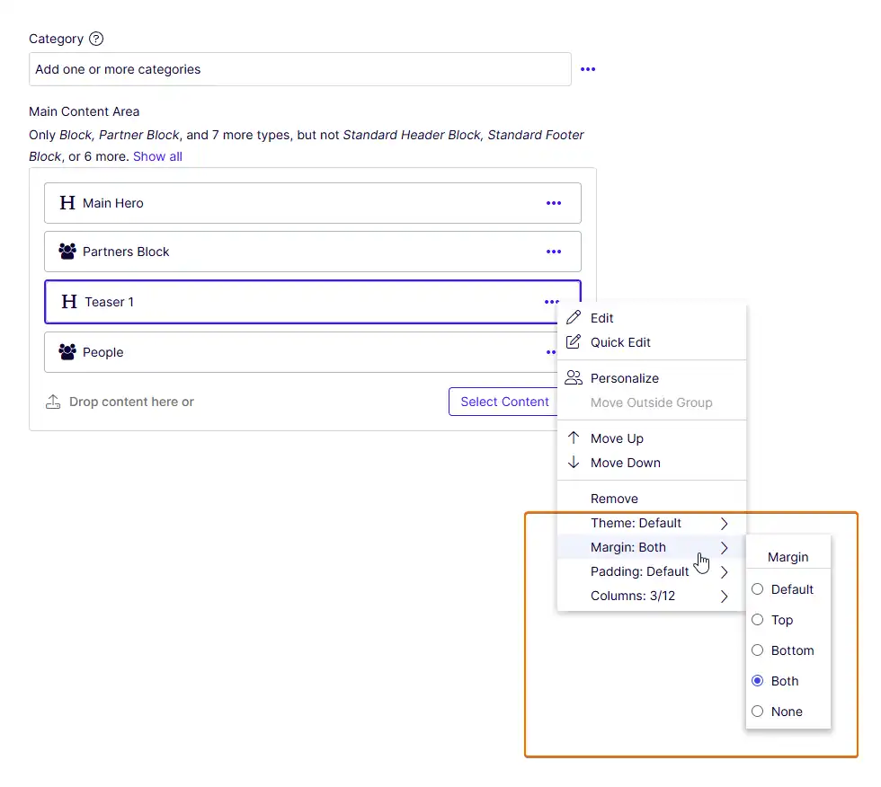
Editors can pick options from dropdown selectors on each content area block, and the selected values are persisted as render settings — ready for your content area renderer to apply as CSS classes or any other rendering logic.
Features
- Define unlimited custom selectors (theme, margin, padding, …) with a simple fluent API
- Options appear automatically in the content area item context menu
- Restrict which options are available per block type using attributes
- Enable selectors for all items in a specific content area using attributes on the property
- Selected values are stored in
ContentAreaItem.RenderSettingsand accessible during rendering - Ships as a single NuGet package — no manual file copying required
Installation
Install from Microsoft NuGet or Optimizely Nuget:
dotnet add package TuyenPham.ContentAreaItemOptionsOr via the NuGet Package Manager:
Install-Package TuyenPham.ContentAreaItemOptionsBuild from source:
git clone https://github.com/precise-alloy/content-area-item-options.git content-area-item-options
cd content-area-item-options
dotnet build
Run the tests:
dotnet run --project TuyenPham.ContentAreaItemOptions.TestsSetup
1. Define Your Options
Create an extension method (or add to an existing one) that builds a ContentAreaItemOptionsRegistry and calls AddContentAreaItemOptions():
using TuyenPham.ContentAreaItemOptions.DependencyInjection;
using TuyenPham.ContentAreaItemOptions.Models;

public static class ServiceCollectionExtensions
{
    public static IServiceCollection RegisterContentAreaItemOptions(
        this IServiceCollection services)
    {
        var registry = new ContentAreaItemOptionsRegistry
        {
            new ContentAreaItemOptions
            {
                AttributeName = "data-custom-theme",
                SelectorName = "theme",
                LabelPrefix = "Theme",
            }
            .Add(new ContentAreaItemOption { Id = "black", Name = "Black", CssClass = "theme-black" })
            .Add(new ContentAreaItemOption { Id = "white", Name = "White", CssClass = "theme-white" })
            .Add(new ContentAreaItemOption { Id = "blue",  Name = "Blue",  CssClass = "theme-blue" }),

            new ContentAreaItemOptions
            {
                AttributeName = "data-custom-margin",
                SelectorName = "margin",
                LabelPrefix = "Margin",
            }
            .Add(new ContentAreaItemOption { Id = "top",    Name = "Top",    CssClass = "margin-top" })
            .Add(new ContentAreaItemOption { Id = "bottom", Name = "Bottom", CssClass = "margin-bottom" })
            .Add(new ContentAreaItemOption { Id = "both",   Name = "Both",   CssClass = "margin-both" })
            .Add(new ContentAreaItemOption { Id = "none",   Name = "None",   CssClass = "margin-none" }),
        };

        services.AddContentAreaItemOptions(registry);

        return services;
    }
}Important:
AttributeNamevalues must start withdata-to be persisted inContentAreaItem.RenderSettingsby the CMS.
ContentAreaItemOptions Properties
| Property | Description |
|---|---|
AttributeName | The render setting key (must start with data-). Used to store and retrieve the selected value. |
SelectorName | A unique identifier for the selector. Also used as the id when fetching a single selector from the REST store. |
LabelPrefix | Label shown in the editor context menu (e.g. "Theme" → displays "Theme: Blue"). |
DefaultLabel | Label when no option is selected. Default: "Default". |
Availability | Controls default visibility. All (default): shown for all content types. Specific: only shown for content types or content area properties with an explicit [ContentAreaItemOptions] attribute. |
ContentAreaItemOption Properties
| Property | Description |
|---|---|
Id | Unique identifier for the option (stored in render settings). |
Name | Display name shown to editors. |
Description | Optional description/tooltip. |
CssClass | CSS class to apply during rendering (optional — you control how this is used). |
IconClass | Optional CSS class for an icon in the selector UI. |
2. Register in Startup
Call your extension method in ConfigureServices:
public void ConfigureServices(IServiceCollection services)
{
    // ... other services ...

    services.RegisterContentAreaItemOptions();
}
3. Apply Options During Rendering
Override ContentAreaRenderer to read the selected values from render settings and apply them. The library's GetApplicableCssClasses method validates that each option is still applicable — checking content-type restrictions, ContentArea property overrides, and the global Availability setting. Stale render settings left behind after a selector was hidden or restricted are automatically ignored.
When you use [ContentAreaItemOptions] or [HideContentAreaItemOptions] on a ContentArea property, override Render to capture the property-level overrides once, then pass them to GetApplicableCssClasses for each item:
using EPiServer;
using EPiServer.Core;
using EPiServer.Web.Mvc.Html;
using TuyenPham.ContentAreaItemOptions.Infrastructure;
using TuyenPham.ContentAreaItemOptions.Models;

public class CustomContentAreaRenderer : ContentAreaRenderer
{
    private readonly ContentAreaItemOptionsRegistry _optionsRegistry;
    private readonly ContentAreaItemOptionsRestrictionResolver _restrictionResolver;
    private readonly IContentLoader _contentLoader;

    // Captured per Render() call — safe because the renderer is registered as Transient
    private Dictionary<string, string[]?>? _propertyOverrides;

    public CustomContentAreaRenderer(
        ContentAreaItemOptionsRegistry optionsRegistry,
        ContentAreaItemOptionsRestrictionResolver restrictionResolver,
        IContentLoader contentLoader)
    {
        _optionsRegistry = optionsRegistry;
        _restrictionResolver = restrictionResolver;
        _contentLoader = contentLoader;
    }

    public override void Render(IHtmlHelper htmlHelper, ContentArea contentArea)
    {
        // Extract property-level overrides from the ContentArea property attributes.
        // This handles [ContentAreaItemOptions] / [HideContentAreaItemOptions] placed
        // on the ContentArea property (e.g. on StartPage.MainContentArea).
        var metadata = htmlHelper.ViewData.ModelMetadata;
        _propertyOverrides = metadata.ContainerType is not null
            && metadata.PropertyName is not null
            ? ContentAreaItemOptionsMetadataExtender.GetPropertyOverrides(
                metadata.ContainerType, metadata.PropertyName)
            : null;

        base.Render(htmlHelper, contentArea);

        _propertyOverrides = null;
    }

    protected override void RenderContentAreaItem(
        IHtmlHelper htmlHelper,
        ContentAreaItem contentAreaItem,
        string templateTag,
        string htmlTag,
        string cssClass)
    {
        var renderSettings = contentAreaItem.RenderSettings
            ?? new Dictionary<string, object>();

        var contentTypeId = _contentLoader.TryGet<ContentData>(
            contentAreaItem.ContentLink, out var content)
            ? content.ContentTypeID
            : (int?)null;

        var customClasses = _restrictionResolver.GetApplicableCssClasses(
            _optionsRegistry, renderSettings, contentTypeId, _propertyOverrides);

        // Pass classes to your view via ViewBag, htmlTag, or however you render blocks
        htmlHelper.ViewBag.CustomCssClasses = customClasses;

        base.RenderContentAreaItem(htmlHelper, contentAreaItem, templateTag, htmlTag, cssClass);
    }
}
Register the custom renderer in ConfigureServices:
services.AddTransient<ContentAreaRenderer, CustomContentAreaRenderer>();Controlling Options with [ContentAreaItemOptions] and [HideContentAreaItemOptions]
The [ContentAreaItemOptions] attribute can be applied to block classes (to enable or restrict options per block type) or to ContentArea properties (to enable selectors for all items in that content area).
To hide a selector, use the separate [HideContentAreaItemOptions] attribute.
The behavior depends on the selector's Availability setting:
Availability = All (default)
All content types see the selector by default. Use the attributes to restrict or hide it:
using TuyenPham.ContentAreaItemOptions.Models;

// Only show "black" and "white" themes for this block
[ContentAreaItemOptions("data-custom-theme", "black", "white")]
public class HeroBlock : BlockData
{
    // ...
}

// Hide the margin selector entirely for this block
[HideContentAreaItemOptions("data-custom-margin")]
public class BannerBlock : BlockData
{
    // ...
}| Usage | Effect |
|---|---|
[ContentAreaItemOptions("data-custom-theme", "black", "white")] | Only "black" and "white" options are shown |
[ContentAreaItemOptions("data-custom-theme")] | All options are enabled (same as no attribute) |
[HideContentAreaItemOptions("data-custom-theme")] | The theme selector is hidden for this block type |
| No attribute | All options are shown (default behavior) |
Availability = Specific
The selector is hidden by default. Only content types with an explicit [ContentAreaItemOptions] attribute will see it:
var registry = new ContentAreaItemOptionsRegistry
{
    new ContentAreaItemOptions
    {
        AttributeName = "data-custom-layout",
        SelectorName = "layout",
        LabelPrefix = "Layout",
        Availability = ContentAreaItemOptionsAvailability.Specific,
    }
    .Add(new ContentAreaItemOption { Id = "wide", Name = "Wide", CssClass = "layout-wide" })
    .Add(new ContentAreaItemOption { Id = "narrow", Name = "Narrow", CssClass = "layout-narrow" }),
};
// This block opts in to the layout selector with all options
[ContentAreaItemOptions("data-custom-layout")]
public class ArticleBlock : BlockData { /* ... */ }
// This block opts in to the layout selector with only "wide"
[ContentAreaItemOptions("data-custom-layout", "wide")]
public class FeatureBlock : BlockData { /* ... */ }
// This block has no attribute → layout selector is hidden
public class PromoBlock : BlockData { /* ... */ }| Usage | Effect |
|---|---|
[ContentAreaItemOptions("data-custom-layout")] | All layout options are enabled |
[ContentAreaItemOptions("data-custom-layout", "wide")] | Only "wide" option is shown |
[HideContentAreaItemOptions("data-custom-layout")] | The layout selector is hidden for this block type |
| No attribute | The layout selector is hidden (Specific mode) |
The attributes can be applied multiple times on the same class, once per selector.
Enabling Options on a ContentArea Property
Instead of (or in addition to) placing the attribute on each block class, you can apply it to a ContentArea property. This enables the selector for all items placed in that content area, regardless of block type. This is especially useful with Availability = Specific.
You can also use [HideContentAreaItemOptions] on a ContentArea property to hide a selector for all items in that area.
using TuyenPham.ContentAreaItemOptions.Models;

public class StartPage : PageData
{
    // Enable the layout selector for all items in this content area (all options)
    [ContentAreaItemOptions("data-custom-layout")]
    public virtual ContentArea MainContentArea { get; set; }

    // Enable with only specific options
    [ContentAreaItemOptions("data-custom-layout", "wide")]
    public virtual ContentArea SidebarContentArea { get; set; }

    // Hide the theme selector for all items in this content area
    [HideContentAreaItemOptions("data-custom-theme")]
    public virtual ContentArea PromoContentArea { get; set; }

    // No attribute → layout selector stays hidden (Specific mode)
    public virtual ContentArea FooterContentArea { get; set; }
}| Usage on ContentArea property | Effect |
|---|---|
[ContentAreaItemOptions("data-custom-layout")] | All layout options are shown for items in this area |
[ContentAreaItemOptions("data-custom-layout", "wide")] | Only "wide" is shown for items in this area |
[HideContentAreaItemOptions("data-custom-layout")] | The layout selector is hidden for items in this area |
| No attribute | Falls back to block-type rules / Availability setting |
Precedence: Block-class attributes take priority over ContentArea property attributes, which in turn take priority over the global
Availabilitysetting. The full precedence chain is:
- Content-type (block class) —
[ContentAreaItemOptions]/[HideContentAreaItemOptions]on the block type- ContentArea property — Same attributes on the
ContentAreaproperty- Global — The selector's
Availabilitysetting (AllorSpecific)If a block type has its own
[ContentAreaItemOptions]or[HideContentAreaItemOptions]for a selector, that restriction applies even if the ContentArea property enables all options. This precedence is enforced both in the editor UI and during rendering viaGetApplicableCssClasses/IsOptionApplicable.
REST Store Endpoint
The package exposes an authorized REST store endpoint via Optimizely's [RestStore] convention:
GET /EPiServer/TuyenPham.ContentAreaItemOptions/Stores/content-area-options/— Returns all selectors with their options and per-content-type restrictionsGET /EPiServer/TuyenPham.ContentAreaItemOptions/Stores/content-area-options/{selectorName}— Returns a single selector
The client-side initializer uses the epi.storeregistry to call this endpoint automatically — you don't need to interact with it directly. It's mentioned here for debugging purposes.
How It Works
- At startup,
AddContentAreaItemOptions()registers the module inProtectedModuleOptionsso the CMS discovers its client-side resources and REST store - When an editor opens the CMS UI, the Dojo initializer registers a
content-area-optionsstore viaepi.storeregistryand fetches all selectors from the REST store endpoint - For each selector, a command is added to
ContentAreaEditor's context menu - When the editor selects an option, the value is saved in the content area item's render settings under the
AttributeNamekey - During rendering, your
ContentAreaRendererreads the value and applies it (e.g. as a CSS class)
Testing
The TuyenPham.ContentAreaItemOptions.Tests project contains comprehensive tests built with xUnit.net v3. Coverage includes:
- Models —
ContentAreaItemOption,ContentAreaItemOptions,ContentAreaItemOptionsRegistry, attributes, and theAvailabilityenum - Infrastructure —
ContentAreaItemOptionsRestrictionResolver,ContentAreaOptionsStore, andContentAreaItemOptionsMetadataExtender - DI registration —
AddContentAreaItemOptions()service registration,data-prefix validation, andProtectedModuleOptionsmodule registration
Run the tests:
dotnet run --project TuyenPham.ContentAreaItemOptions.TestsChange logs
v3.0.0
- Update to .NET 10 and CMS 13
Requirements
From version 3.0.0:
- Optimizely CMS 13 (EPiServer.CMS.Core 13.0.0+)
- .NET 10.0+
For older versions:
- Optimizely CMS 12 (EPiServer.CMS.Core 12.23.1+)
- .NET 8.0+
License
Apache License, version 2.0