72 Must-Have Features for Ecommerce Website
The infographic about 72 key features that any successful ecommerce site must have. If you are designing a new ecommerce site or redesigning an existing one, chances are you’ll find this infographic very useful.
The success of an ecommerce website doesn’t solely depend on the quality of its products, there is a range of other factors at play. Two of the most important are how the site is marketed and how it is designed.
An intuitive and personalised online shopping experience is what every customer expects from ecommerce sites. And developing a website adjusting all the must-have features is one proven game changer of all time that can turn your business game strong alongside maximising customer satisfaction.
There are certain features that can help make an ecommerce website more user-friendly to customers and easy to manage from the perspective of the owners. But when designing a site, it can be tricky to account for all these essential ecommerce website features and stylistic elements.
The infographic below shows 72 key features that any successful ecommerce site must have. If you are designing a new ecommerce site or redesigning an existing one, chances are you’ll find this infographic very useful.
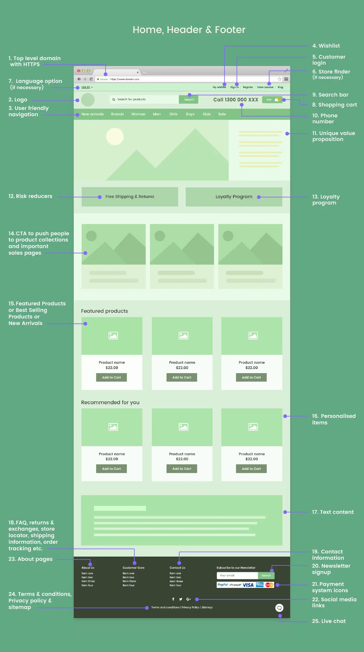
Home, Header & Footer Features List
An ecommerce site must have a top level domain with a secured connection. If your site exclusively serves a certain country, then use a country code domain.
A business logo works as a communication tool which is crucial to make a strong first impression. Place your business logo in a prominent position on the header. Preferably near the left is considered an ideal spot. Consider the size, background and format as well.
A clear navigation bar improves the UX of your site – mandatory for every page. A simple navigation structure turns your website understandable as it requires less effort and brain work. However, it requires careful consideration to design your website navigation.
Sometimes, a customer may be interested in a product but decide to buy it later. Or a customer may find a product interesting and want to check that later for more details. A wishlist allows them to store a list of these products so that they can easily find them the next time they visit your site.
Your site should definitely let the customers register and log in. The login features assist customers in tracking their products effortlessly. It’s best to place this on the top bar for easy access.
If your ecommerce site has physical stores or pick-up points, a store locator at the top bar can make them easy for your customers to find. They might look for the feature to confirm details like holiday closings, business hours or other location-specific amenities.
If your ecommerce site has multiple versions for different regions, then you can include language options to let users switch between different languages/regions.
Obviously, the shopping cart is an integral part of any ecommerce site. This feature works as an intermediary between the product page and the checkout process. The best position to place it is in the upper right corner.
If you optimise your search bar properly, it can become a powerful tool for conversions. Alongside helping your visitors to find what they need, a search bar will let you understand what people want from you.
Whether it be enquiring about a particular product or clarifying business hours, customers may need to call you for various reasons. Mentioning the contact number at the top makes this easy for them.
Why should a customer buy from you and not your competitors? Use Unique Value Propositions or UVPs to mention those things about your business that make it special.
Include a few good risk reducers, such as free shipping and return offers, at this point to attract your potential customers. Because online customers now expect free shipping and returns as standard.
Mention things like reward points and other special offers for your long-time customers. Include a link that takes them to a more detailed offer page.
Include important product categories and relevant Call To Action buttons here. Use wordings that describe what the CTA does, like “Add to cart”, “Buy Now”, or “Checkout”. You may also provide links to sales and special offers pages.
You may manually add featured products or automate the process to show a list of best-selling products here.
You can show potential customers items based on their search or purchasing history. This is a very effective way to increase sales and revenues significantly.
From an SEO perspective, including some description of your business is important. Also, a potential new customer will be able to quickly know about you from this.
These pages are important for your customers. So provide links to them at the footer with a title, something like Customer care can be appropriate.
It’s good to provide several ways to contact your business to make it very convenient for your site users to get in touch with you. Phone, email and inquiry form submission are three common ones.
As a modern ecommerce site, you should have a newsletter signup form that collects your customers’ email addresses. You can send them special offers and inform new product arrivals.
It’s customary to include payment system icons at the bottom of the page. This lets your customers quickly know which payment systems you accept.
Providing links to your social media accounts at the bottom of the page lets your customers stay connected. Adding social media links improves your digital presence while getting the user interaction right.
Shoppers who are interested in the company’s mission often tend to navigate to an About us page. Here you may include a link to your more detailed About us page, including affiliate, press and career pages.
Look for the clearest and most prominent placement where it will be easy to notice and always be attainable. These standard documents and the sitemap can be placed at the bottom of the page.
Live chat is common on many ecommerce sites nowadays. When it comes to providing high-quality customer service, adding a chat service does the best. But to implement and maintain a proper live chat option requires careful planning and resources.
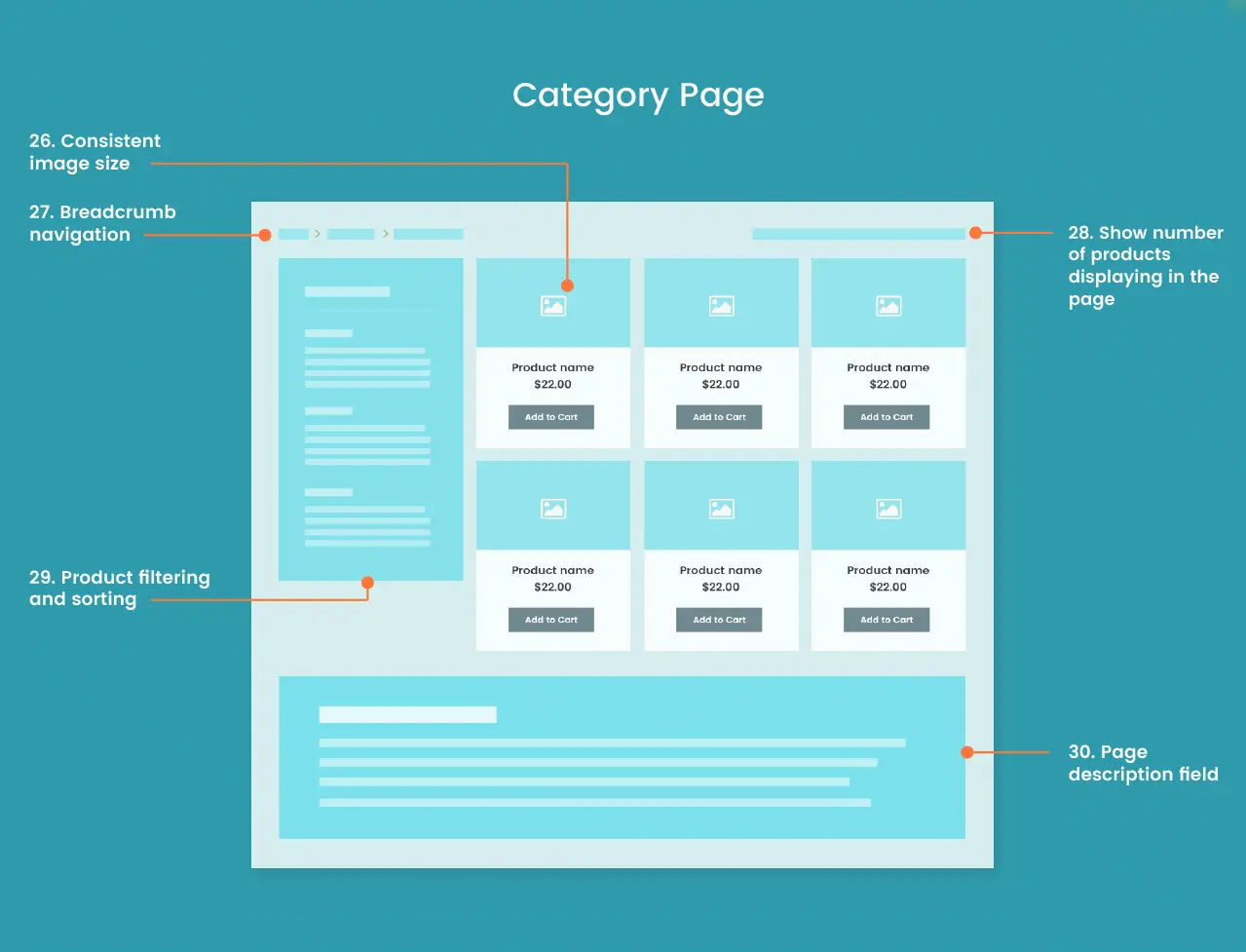
Product Category Page Features List
The product images on a category page should have a consistent size. It’s not just about the resolution; they should have a similar amount of whitespace at the borders too.
Breadcrumb navigation helps visitors easily browse through product categories. You can include it right below the main navigation bar.
Generally, a page can’t show all the products that there are under a certain category. But every page should show the customers the total number of products and the range that they are viewing.
Product filtering allows customers to filter products based on different attributes. For example, a clothing store may use gender, size, colour etc., as its filtering options. The sorting allows viewing products in ascending or descending order of price and arrival.
In this part, include a short general description of the category. This is mostly for search engines as it helps to rank in search results. So you can optimise your page description with any targeted keywords while providing important information about the category page.
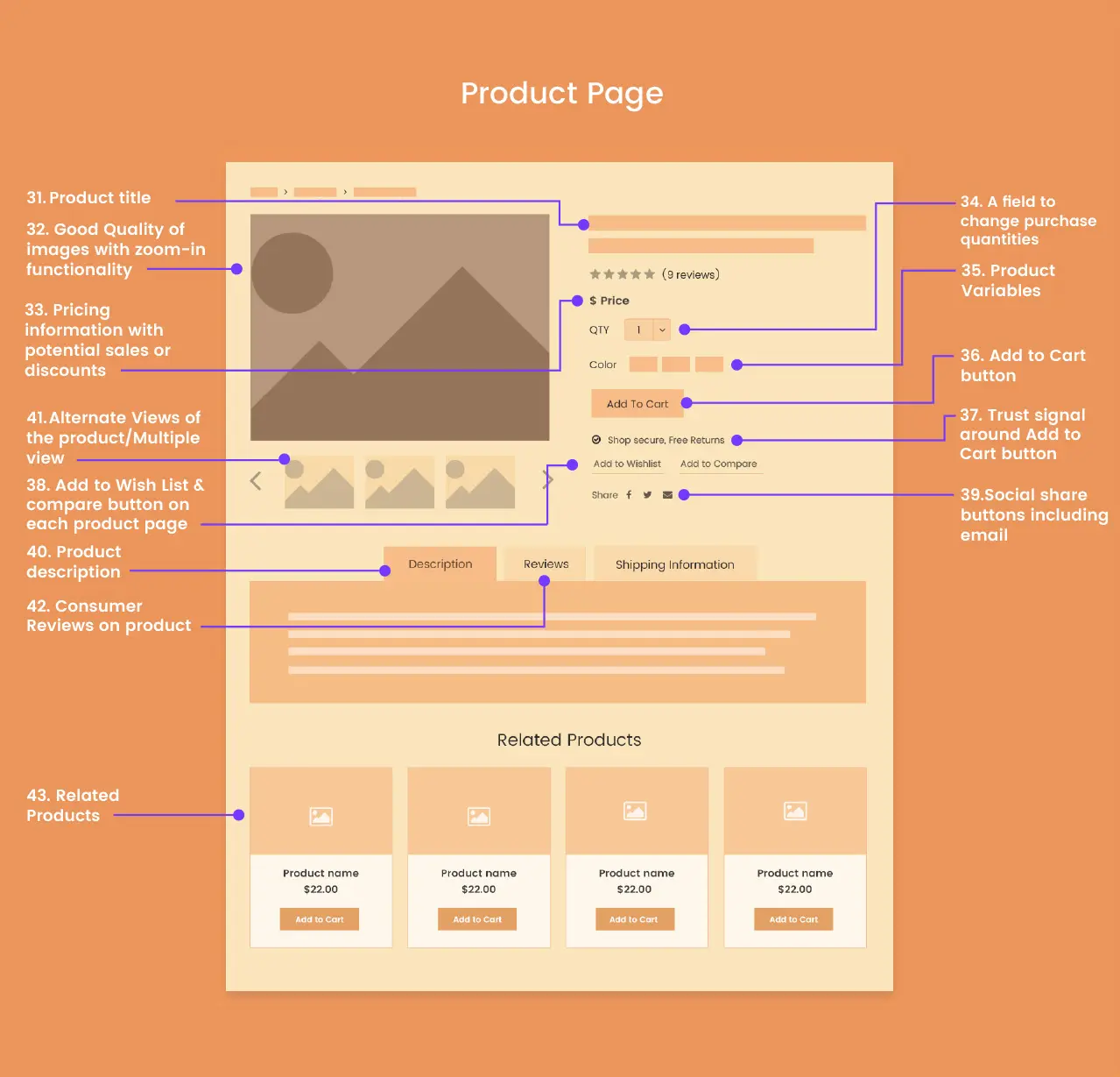
Product Page Features List
This is simply the name of the product. The name of each product should definitely be unique, but maybe with different colours and sizes, if applicable.
On the product pages, there should be high-quality images that can be zoomed in to view particular parts of the product.
Apart from mentioning the product price, it’s a good idea to mention if there are any discounts or promotional offers. The common practice is to strike through the previous price and write the new price with the discount percentage in brackets.
Just below the product price, there should be an option to change the product quantity. That way, the customers can easily select the number of items they want to buy.
Some variables, like the colour and size of a physical product, should be selectable right from the product page.
The Add to Cart button should be prominently displayed beside the product image. The option adds more charm to the customer’s online shopping experience.
It’s a very good idea to mention a few trust signals near the Add to Cart button. This influences the subconscious of the customers in making the purchasing decision.
A wish list enables customers to store a product if they want to buy one later. It ensures that they can come back later and quickly find it with little time, and this results in fewer returns. A compare feature can also be very useful for them.
Let your customers share their favourite products. Adding social share (and sending links via email) buttons is a really great way to reach more people. You can implement the buttons beside the multimedia views of your share-worthy products.
Product descriptions and specifications are absolutely essential parts of the page. Try to include all the essential information a customer may look for. Use natural language and powerful words, and focus on the benefits.
This part will let the customers read, rate and give reviews of products. As we have shown, the average rating and number of reviews should also be shown right below the product name above.
Include a list of related products at the bottom of the page. Using related item recommendations will provide a more satisfying and personalised experience. This may prompt the customer to find the product that he/she wants.
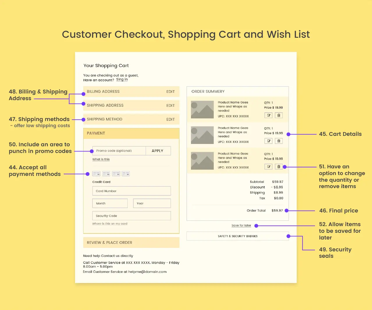
Customer Checkout, Shopping Cart and Wishlist
Your ecommerce site should accept most of the payment methods that are popular among your customers. Provide the option to generate the invoice and accept payment instantly.
Mention all details regarding what the customer has in the cart. It should definitely be the product name, price and quantity of individual products.
Obviously, after mentioning the price of each individual product, your checkout page should also mention the total price. Don’t forget to mention the individual amounts of discount, shipping cost and tax.
Your customers will find multiple shipping options very convenient. There should be at least one low-cost shipping option.
It’s common to have two address fields. One for the billing address and another for the shipping address. For many customers, these two are different.
Show security seals near the field where the customers enter their credit card information. These security seals or trust badges help to convince your customers about the security of your site and the payment process.
Your business may occasionally provide promo codes to customers. This field is where customers may apply the promo codes to get discounts or other privileges.
Also, provide an option to edit and remove items from the checkout page. Note that there should be an option to save the cart for placing the final order later.
If, for any reason, a customer doesn’t want to go through the payment process at this stage, provide them with a way to store their cart in case they want to come back later.
Ecommerce Blog Features List
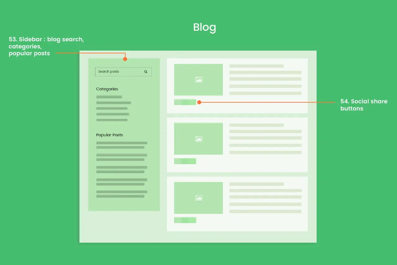
The sidebar of your blog page should have a search bar, a list of categories (organising the blog posts) and a list of the most popular posts. This can be placed at the top left of your web page’s primary content area.
Let your readers share the posts they like using social share buttons. Maximise your social media exposure on your blog and increase your blog traffic as well.
Back-end Features List
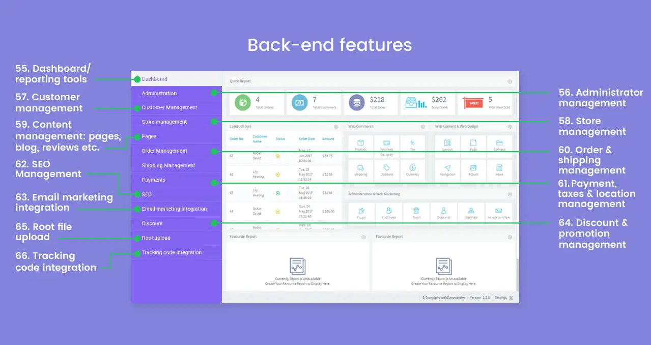
The dashboard should allow you to view all ecommerce metrics in a summarised way. It should be customised to meet your specific business needs.
Usually, a website will have a number of managers. You, as the owner, should be able to decide who can access which part.
Managing customer orders and their account information is a mandatory feature. It’s better to store customers’ search history too. That may help you to provide personalised offers to frequent visitors.
Product specifications, like – categories, colours, descriptions, sizes etc., should be very easily editable from the backend of your site without assistance from a developer. You should also be able to select the featured products.
The pages of your site, their layouts, your blog and other contents of your site should be manageable from the backend without any manual change in the code of the site.
At any certain time, an ecommerce site will obviously have lots of orders in the process at different stages. It also needs to handle different shipment processes. All of these should be easily manageable from the backend.
Your site’s backend platform should be easily able to manage different payment processes, calculate and apply taxes, and determine the price structure based on locations.
Aspects of SEO, like URL editing, title tag, meta description management etc., are common parts of an ecommerce backend platform.
Usually, backend management platforms can have email marketing features integrated into them. Sorting and storing customer emails and sending personalised emails are very useful to increase conversions.
Applying varying discounts and introducing different promotional offers becomes a lot more hassle-free if your backend provides these facilities.
Uploading files directly to the root of your site may often be needed. And your backend should make the process simple.
You should have the ability to upload files like robots.txt, tracking codes and other third-party verification codes without help from a developer.
Others
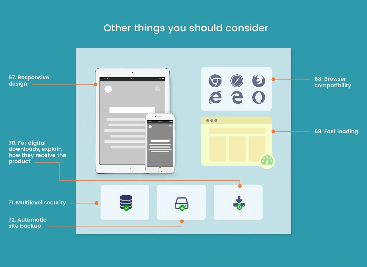
It should go without saying that designing a responsive website is a mandatory skill for any Melbourne web design company. Regardless of device size, your site should be flexible enough to provide the best user experience.
Make sure your site is properly rendered in all major browsers. Otherwise, it will be challenging for your users to engage with content, and this will impact your conversion rate and site traffic.
Page loading speed is a crucial factor both from the perspective of user experience and SEO. Customers will definitely leave a site if it takes more time to load.
If your ecommerce site is selling products as digital downloads, explain to your customers how they are going to receive the product (i.e. direct download, email etc.).
Security is always one of the most important aspects of any ecommerce business. Apart from SSL certificates and PCI compliance, your site should have a strong firewall and layers of security on login and contact forms.
Your site should be automatically backed up to prevent any accidental mishap. For an ecommerce site, it’s very important to always remain live.
So these were the most important features of an ecommerce site. Of course, depending on your business type and products, you may modify these features or add other ones. Nevertheless, this infographic will give you an essential overview of things that a standard ecommerce site should have.
Source: WebAlive.

